Pinwheels with GelliArts® and DecoArt®


When I think of summer I always think of pinwheels! They are colorful, interactive and easy to make.  In this video tutorial, I am using DecoArt® Americana premium acrylic paint on my GelliArts® printing plate. Thank you to both these companies for making quality products that are a joy to create with! Happy Creating!


Supplies used in this tutorial:

Gelli Arts® 9x12 printing Plate

DecoArt® Americana premium acrylic paint

Smooth white cardstock

3/8" diameter wooden dowels (painted with the DecoArt® paint)

Texture tools:
       Bubble wrap
       Princeton Catalyst Blade
       Cake decorating tool (the long white zigzag thing :) )
       Gelli Arts® mini printing tool
       cardboard tube

Rotary cutter with a scalloped blade

Push pins/thumbtacks

Awl 

Scissors

Glue Stick or other quick drying glue


MAZE BOOK with Gelli Arts® and Dare 2B Artzy®


If you have been visiting here for a while you might pick up on the fact that making books by hand is one of my very favorite things! In this video tutorial, I am showing how to make a Maze Book (also called a Snake Book). This is a structure that can have many variations so use your imagination and go for it! It was a pleasure using stamps from Dare 2B Artzy® and printing plates and paints from Gelli Arts®. Happy Creating!


Here is the quote I used in my book:

The artist is the confidant of nature, flowers carry on dialogues with him through the graceful bending of their stems and the harmoniously tinted nuances of their blossoms. Every flower has a cordial word which nature directs towards him.
Auguste Rodin


Supplies used in this tutorial:

Dare 2B Artzy® clear stamps: Totally Tracy - Power of Flower, Be Bold and Splatter Textures

Acrylic stamp blocks

Gelli Arts® 9x12 printing Plate

Gelli Arts® Premium Acrylic Paints

Gelli Arts® mini gel plate

Gelli Arts® mini printing tool

Gelli Arts® Brayer

Bubble wrap

12x12 Kraft cardstock by The Paper Studio

Bone folder

Ruler, Utility Blade and cutting mat

Versafine Onyx Black stamp pad

Prismacolor colored pencils


Bookmaking with Gelli Arts® and Art Foamies


I have seen this book structure called a squash book or explosion book. It looks simple but packs a punch when you open it! I love the movement of this book as it is opened and closed. A simple Google search will give you pages of inspiration for the many ways this book can be interpreted. 

Let's get started!

The supplies I used are:


3 sheets of black cardstock cut to 8.5" squares

White cardstock for monoprinting


Brayer


Random items for texture (plastic scrubbie, texture brush)

Art Foamies Stamps (I used this one and this one)

Bone Folder

Good quality glue stick (you could also use two-sided tape) 


Step one:
Create a bunch of abstract monoprinted papers! These papers will be trimmed down to be glued inside our book. Use texture tools to add variety to your prints.  Make sure to have at least three printed layers for your finished paper.


I used the Art Foamies to stamp onto the plate to lift the paint off and then stamp onto a finished paper. 


Step two:
While the monoprinted papers are drying it is time to fold the black paper to create the structure of our book.


Now that they are folded it's time to glue them together.


A note about my choice of glue: Since this project is made entirely of paper I am using a permanent glue stick instead of a wet glue in order to keep the papers from wrinkling and curling when they are glued together. You could substitute a thin layer of gel medium or Yes! paste for the glue stick but you would need to leave the papers to dry flat under a stack of heavy books to minimize curling. 

Step three:


Time to cut up our monoprinted paper and glue it to the inside of our book structure. This part reminds me of krazy quilts. I really like how all the different patterns, colors and textures are rearranged to make something entirely new!


Cut eleven 4" squares from your collection of papers. Six of them will be cut in half diagonally to make triangles. Of the remaining squares, four will be glued to the inside of the book (along with the triangles) and the final two will become the front and back covers.


To make this even more fantastic, and if you have enough printed papers, you could cut an additional eight squares, dividing six of them into triangles and attaching all of them to the backside to create a two-sided book! What a creative way to convey two different points of view!

Step Four:
At this point you can add words or other embellishments. I am planning to add journaling on the back of the book with a paint pen. You are only limited by your imagination!


One last thing, if you want your book to stay more flat when it is closed without needing to add a ribbon or band, just place the folded book under a stack of heavy books overnight. You are the artist so choose what you like best! Happy creating!


Creating Holiday cards with Gelli Arts®


It's Holiday card time!!! I love the classic look of a bulb ornament and using a 3" circle Gelli Arts® monoprinting plate as a stamp makes this design super easy. Add in some texture from crocheted lace and you have a stunning result! There are just two mono-printed layers for each ornament and a few small finishing touches. I have included a video of my process as well as written step by step instructions. I hope they inspire you to create your own!


Let's get started!

Here is what I used:

3" circle Gelli Arts® monoprinting plate

Acrylic Stamp block (big enough to fit the Gelli Arts® plate)

Gelli Arts® Premium Acrylic Paints

Brayer

4x5.5 and 3.5x5 Kraft colored folded cards (with envelopes, from your favorite craft supply store) 

Lace (I used a crocheted lace found at a thrift store)

White Uni-Ball Signo gel pen

Silver Sharpie

Silver paper (or silver paint to make your own silver paper, that's what I did!)

optional: something to make your silver paper look corrugated. (I used a Marvy Uchida corrugator)


Step one: 

By placing the Gelli Arts® printing plate on the acrylic stamp block you can now use it like a stamp! The first layer of our ornament design is just a plain circle printed on the front of the card. This is done by adding a dab of paint on the Gelli Arts® monoprinting plate, spreading it around with the brayer and then "stamping" it down onto the front of the card. 


Go ahead and stamp as many cards as you would like. (I always make sure to stamp more than I need to account for mistakes. 'Cause mistakes happen, amiright?!) The colors I chose for this step are darker colors. Reds, greens, blues and oranges all worked well. I don't clean my plate between colors because I like the way the leftover colors leave little bits on the image. 


Step two:
The next printed layer adds the pattern to the ornament. Choose a lace with a bold design. 


The best colors you can choose for this layer are white or black but don't forget that contrasting colors can really pop. If your first layer was blue then a yellow or orange would be lovely. Take your chosen color and spread it onto the plate with the brayer. Position your lace on the plate, take a scrap paper and place it on top of the lace and gently press down. Lift the lace off the plate and you will be left with a gorgeous design. 


Take your printing plate, flip it over and line it up with your circle on the front of the card and stamp! Make sure the colors you choose for this step are either much lighter or much darker than the colors you chose in step one in order to achieve the best contrast.


Step three:
Now's the time to add a few details to transform the circle shape into a recognizable ornament. First, take a silver pen to draw a vertical line up from the top of the ornament to the top of the paper. 


Cut small rectangles from a corrugated piece of silver paper and glue it to the top of the ornament. (I created my own silver paper by painting white cardstock with silver paint and, when dry, running the paper through a Marvy Uchida Corru-gator paper crimper.) Please keep in mind that plain silver paper would work as well! The corrugation is optional. 


Step four:
The final step is a handwritten sentiment! I like using my handwriting to give my cards a special made-by-me touch. Feel free to add your sentiment anyway you like! 


Happy Creating!


Flexagon Book

This post originally appeared on the Artistcellar blog.

Today I am bringing you a bookmaking project but it is not your average book. I was browsing through my collection of art books looking for inspiration when I revisited Alisa Golden's Expressive Handmade Books. (If you are in anyway interested in learning more about handmade books I highly recommend checking her books out.) The book structure that caught my eye is the Square Flexagon. The Dictionary defines Flexagon as a "folded paper construction that can be flexed along its folds to reveal and conceal its sides alternately." And no, it's not origami because you'll use scissors and adhesive to create it and the structure has its roots in mathematics. Don't be nervous! Here we go!

The square flexagon starts with a square piece of paper (surprise surprise!) and for mine I used a large 18x24 inch piece of Strathmore Mixed Media paper which I cut down after I had both sides decorated.

On one side I used Inktense blocks to rub colors  all over the surface and then using a dry brush and a water spritzer I moved the color around and set the ink.


When that was dry I used the same blocks to create a multitude of skinny stripes all along the paper.


Then using the largest Dot stencil from Artistcellar's Halftone Dots Series and white gesso I added several sections of faint white dots.

The other side of the paper started the same with rubbing the sides of the inktense blocks on the surface and wetting the ink to move the color around.


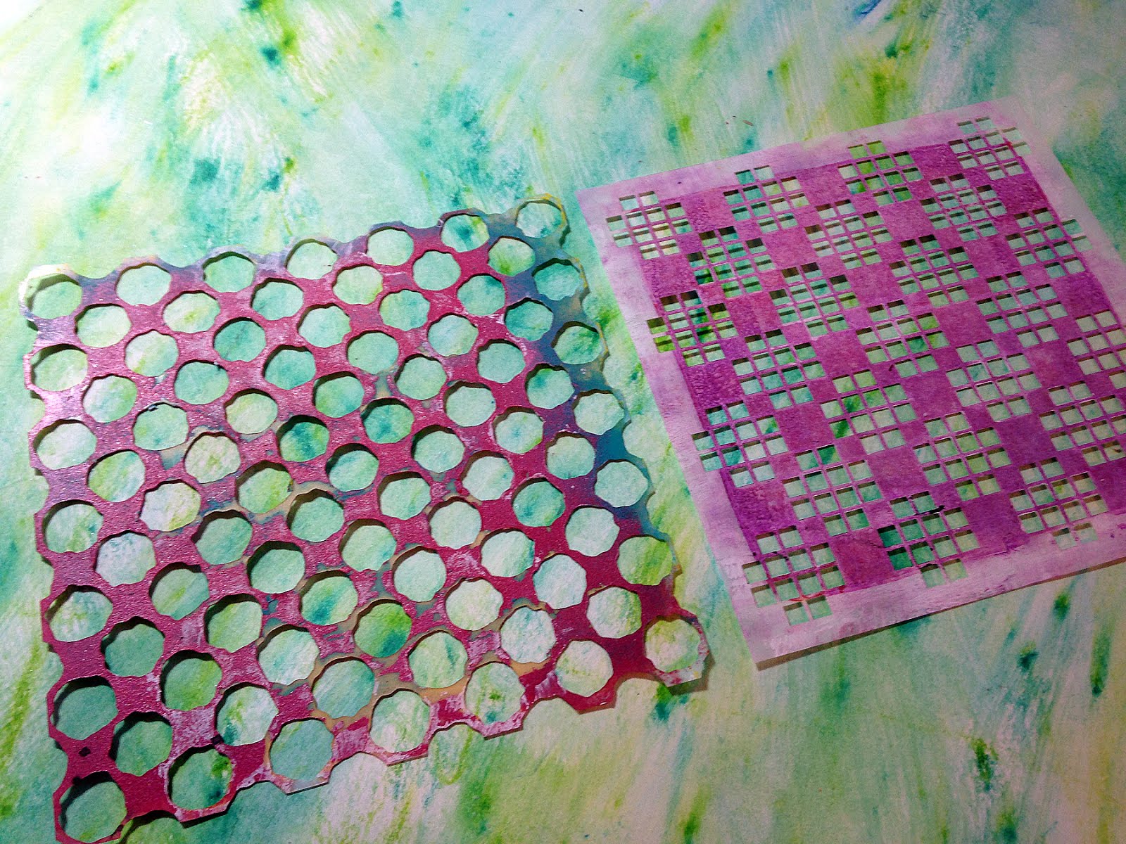
Then I used clear gesso with the largest Halftone Dot stencil and the Open Work stencil from the Artistcellar Blocks series all over the surface. This will create a resist.


Once the gesso was dry I sprayed the entire surface with some Dylusions ink sprays and then wiped off excess ink with a paper towel.


The resist effect was subtle but nice.

I wanted to bring back more white into the design so using the same two stencils and white gesso I covered the surface with alternating dots and squares.


To contrast all the small elements going on I decided to paint a large circle design as the final layer. I used yellow Dye na flow first and then Dina Wakely's Night color on top. Bam!


Now's the time I cut my paper down to a square.


There is a great contrast between the two sides. One is lighter and easy going. The other is darker and complex. I can see how these foundations can work together to create a thoughtful dialogue. As an artist I try to communicate SOMETHING in every piece of art I create and using a handmade book as the structure makes it even more interesting!

Here is the paper after I have made the folds and cut out the middle. (Which I also made into another square flexagon!)


Here is the result! Fun, right!?


Many thanks to my eldest daughter for the wonderful hand model work!

Now comes the content but I will be working on that later. I have some thoughts and reactions that I'll get down on paper but I want to get them right before I decide how to put them down on the pages. All in all there will be 6 different "pages" to fill. Personally, an artist's book must have content to give it meaning. Whether that content is words, pictures or even the materials the book is made of. I hope you give this fun book structure a try!

What is the story you would tell?

What's your WHY?

Hello fellow creatives! Welcome to my blog and I hope you find some inspiration here. 

How exciting are monthly challenges?! Focusing on the personal nature of art-making speaks to my heart and it is a joy to participate. Dina has a great vision and I'm so happy to add my art. What a great group of inspiration, amiright? Are you ready to show your MEdia??

This month's challenge:
Create a piece of art that shares with us your “why.” 
Why do you create? What compels you?

I worked in Dina's Media Journal on a Kraft paper page. First I'll explain the process and then I'll explain the WHY. Woohoo! Let's get started!


Here's a list of supplies I used:

Scribble Sticks
Heart stamp from DW Media Homage to Frida set
DW Acrylics: Elephant, Penny, Ocean, Blushing, Umber, Night, Lime, Lemon and White
DW Media Tape
DW Stencil - Leafy
Black Acrylic Paint pen

Using the Penny paint with the Leafy stencil I created a nice shimmery background. I then placed media tape on the top and bottom of the page. Using a pencil I sketched a portrait in the middle of the page and then used the scribble sticks to outline my image and add a layer of color. I love how the scribble sticks are water soluble because then it creates a blended look. When dry I used DW paint to paint the face and the colors blend beautifully with the underpainting created with the scribble sticks. It all works together to give the face depth and life.


When I am happy with my portrait I create texture around the face with repeated dashes using various tints and tones of my favorite colors. My goal is to make it look like energy is emanating from the figure because that is how I see creativity.


Words in my art is very important. Sometimes I have alot to say and sometimes I only need to say a word. This time I had alot to say to express WHY I create and what compels me to.


The finishing touches are an enlarged hand-drawn eye that I glued on top of the face and an embellished heart from the Homage to Frida stamp set.


Now for the WHY:

To me I need to create because I like to solve visual puzzles and create things that make my eyes smile and to fill my heart with fire. I like to make things I have never seen before and see what happens. My art has to have parts of me embedded in it. I tend to have a difficult time expressing myself verbally and I find that when I work in my art journal, on a canvas or with bits of paper I communicate things I didn't realize I was feeling. 

I agree with Dina that art is personal and it will be a joy to use the monthly challenges to create more authenticity and find out more about ME! I hope you are inspired to put the ME back in your media this month with this challenge.


Happy Creating!! Remember to use the hashtags #showusyourMEdia and #rangerink when you share your work online.

Dots dots dots

This post originally appeared on the Artistcellar blog on May 4, 2016. It's one of my favorite pieces and I am happy to share it with you here.

One of my favorite things to use in my art are repeated elements.  Such an easy way to create rhythm, continuity and texture. One of my favorite elements are dots, circles, round things. Dots as texture is just yummy and is a simple way to add a bit of interest to anything you are creating. When I am stumped as to what I should add next? Dots. When I need a little texture? Dots. I have bubble wrap, sequin waste and other recycled packaging that I use to create dots. Recently I got my paws on the new Halftone Dots stencil I admit I squealed a teeny bit. Oh man, these stencils are a game changer. They are great on their own and even better layered one on top of the other. They don't quite line up which ends up being divine and they are not perfect circle dots which makes them oh so interesting to look at. Have I convinced you yet? Read to the end as there is a GIVEAWAY you need to be a part of!

For this weeks project I pulled out an abandoned canvas (please please please tell me you have those too!!) with a textured red background. Hmmm, what should I add next? Yep, you guessed it, DOTS. Keep reading and let me take you on a journey of my artistic process with oodles of pictures.

Supplies used:
8x10 stretched canvas (abandoned in the back of my closet)
Halftone Dots stencil
Dina Wakley Acrylic Paints
Isopropyl Alcohol
Old dictionary pages
Soft gel medium
Gold Leaf and adhesive

Let's get started!

I applied two layers of acrylic paint with the two larger dots stencils (with a make-up sponge) and let the paint dry a smidge between layers.


I tore a sheet of dictionary page to create a landscape and attached it with gel medium. Using Dina's Night color I glazed the edges of the canvas to add depth.


The next layer is white paint and the next size down of the Halftone dots. I also added a green wash to the dictionary page landscape.

At this point I decide to put the focus of the composition in the sky. To define this focal point I used white paint to create a circle and tried out some metallic paint for contrast. 


I decided three angels would occupy the space and cut out dresses from more dictionary paper and heads from thin chipboard. I glued the dresses down with soft gel medium and added a wash of white to them. To the heads I started adding paint for the faces.


I ended up using alcohol to rub off a few layers of paint in the circle area and liked it better that way. I sketched in the arms, wings and faces of the three lovely ladies. I also added yellow around the circle area too.

I thought I would create their faces on chipboard and then attach them but scratched the idea and went ahead and painted them directly on the canvas. The following pictures show the evolution of the characters with their faces, arms, wings and crowns.


To further define the focal point I added a raw umber glaze to the outside of the circle. As a finishing touch for the angels I added gold leafing. 


So there you have it! I have a few finishing touches I want to add but am going to let it sit for a day or two to let it simmer. For sure I will be adding another layer to the outside of the circle with the smallest dots stencil to add more (you got it) rhythm, continuity and texture.

Small Canvas Quote

This post was originally found on Artistcellar's blog. 
You can find the original post there.

Remember the delicious backgrounds I made when I was experimenting with Mineral paper? If not please check it out here.  These canvases have been waiting patiently for the next step in their journey and this week I grabbed one, painted the edges black and got started.


Using various colors of Dina Wakley's yummy paints and the Marked series of stencils I created layer after layer on top of my original background. Doesn't this look divine? The transparency of the paint really makes the layering process fun and surprising.


I decided that I wanted the focal point to be an inspirational quote so I picked on of my favorites and used Photoshop to type it out and reverse it before I printed it using my laser printer.


After tearing it out I placed on my nonstick craft sheet and brushed a layer of gel medium on top (like I was buttering toast) and let it dry. Yep, I am making an image transfer!


After the gel medium dried I peeled it off my craft sheet, soaked it in water and began to gently peel the white paper off. Gel medium image transfers are cooooool.


While I was waiting for the gel medium to dry I painted a swatch of white on the canvas where I wanted my quote to go. By the time my image transfer was ready so was my canvas. I gently tore the edges of the image transfer down so it would fit within the white swatch and then, using gel medium, I glued the quote onto the canvas.


As a final detail, I used the X stencil from the Marked series to paint the edges of the the canvas.


I really like the final product and I am picking out quotes for the other small canvases. I hope you all will try this quick and easy technique to add text or designs to your art. Many thanks to my oldest daughter for being my hand model!

Watercolor Affirmations

This post was originally posted on the Artistcellar blog. I hope you find inspiration from this quick technique. Make some cards and mail them to the people you love!


My family and I had a relaxing a fun Spring Break that was spent with extended family and included visits with friends. It was so nice that I had a verrrrry difficult time coming back to "real" life and the daily chores I wish I could avoid. With this laid back attitude I decided to create a few simple abstract compositions using the sacred geo 2 stencils. I didn't want to worry about a deeper meaning or what I wanted to communicate. I just wanted to make something cool and not have to give it a purpose. It was a perfect project to do relaxing on the couch with a favorite tv show on.


I scrounged up a few small sheets of mixed media paper that had random marks on them from when I was playing around with watercolor. It was the perfect first layer. For the second layer on a few of them I placed the stencil and lightly brushed water color paint on top of it. This ends up giving a imperfect, grungy look.


Grabbing a fine tip waterproof pigment ink pen (like a Faber Castell Pitt pen) I placed the stencil back into place and began to trace along the design. I paid attention to what sections I traced and purposely left out others so that it would not come across too obviously that I was tracing a stencil.
I was strictly looking at it as an abstract composition and making sure I had a good visual balance, some repetition, and interesting positive and negative space. (basically all the things I have been trying to teach my little K -2nd graders at school. Ha!)

Once the ink lines were dry (which isn't too long because it is a thin line) I went back into my watercolors to add another layer and started defining the space in my composition by adding complementary colors. The texture watercolors make is oh so dreamy. If you don't have watercolors then go ahead and use a nice acrylic paint you've thinned out with either a fluid medium or water.


Finally I grabbed my fine line pen again and added small decorative elements. Lines, dots, short phrases. Basically anything to give it some more interest. And after looking at them now I can see their purpose! They will become cards to send to a few dear friends. So interesting that even though I started off without a purpose I made art anyways and the art let me know what they needed to be.


Have a creative week!